I decided to first sketch my design then draw around it more neater, using microfine pens to complete the design. Before even attempting to draw, I knew it would be much more efficient and effective to ONLY draw half of the design. Then once finished I could use Illustrator to digitally develop & reflect.
Sources of Inspiration.
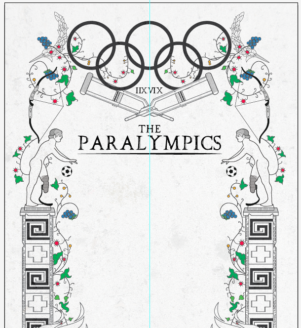
After analysing my findings I realised that the pattern below could communicate a very clear message, the lower rim features a cross, a cross very similar to the red cross!
The paraylmpics was initially started as a rehabilitation programme for injured soldiers after WW2, It was also started in Britain.
The final drawing.
I really struggled with the application of colour on the front cover, I was stuck between the idea of communicating;
'To do with the rehabilitation of soldiers' = Red/White/Black.
'To do with the Olympics/Paralympics' = Olympic ring colours/ Paralympic emblem colours.
I thought the wreath became a really successful part of my design, it started off as just a simple, one sided wreath to decorate the corner of my border, keeping the design 'connected'.
After I'd positioned and replicated the design, I was able to create my own personal wreath, because of its detail, I had alot of scope to actually edit the design (Colouring each leaf a different colour if I'd wished)
Background Research: WREATH...
The wreath existed because it was the prize for the winner at the ancient Olympic Games. It was an Olive branch, taken from the wild olive-tree (Olea) that grew at Olympia, intertwined to form a circle or a horse-shoe. According to Pausanias it was introduced by Heracles as a prize for the running race winner to honour his father Zeus.
Because I'll be incorporating Greek attributes of the ancient games/ with Paralympic influence, I also decided to create vines going up the pillars. It was quite easy to develop because I went for a simple approach, using mainly circles and odd leaves, Which in the end looked quite effective.
As a follow on from these decisions I hand drew some simple but effective tree vines, decorated with simple flowers and simple leaves. I've stepped out of my comfort zone with this design in the sense that I wouldn't usually do a simple drawing, however I'm very pleased with the result. After drawing around the drawing on Illustrator I was able to select certain parts of the decoration...rotate...and use as a platform for text.
For the prosthetics page I was tempted to use a 'flexfoot' which is a prosthetic leg todays Paralympic athletes use, made more prevalent by Oscar Pistorius, track athlete. I wanted the design to be quite simple so then I could rotate and use the 'fill' tool to create a design that would fit with the theme of my publication.
Producing the design on various layers meant I could easily alter and edit more efficiently.
The Inspiration for my stock is displayed in my design development booklet. The extra colour page adds another sense of depth to my publication, and also fits nicely with this style of border..
If I was going to do it consistently white there wouldn't have been enough variation because the border is quite a large focus of the design.
Illustrator generated imagery.
For one of the designs I thought it would be interesting to investigate how many Gold medals have been won over the years/ which Nations are at the forefront of winning. As a form of primary research I took photographs of a personal medal I'd won during my Judo competitions.
{Click to enlarge} Moodboards, investigating the relationships between type, colour and image.